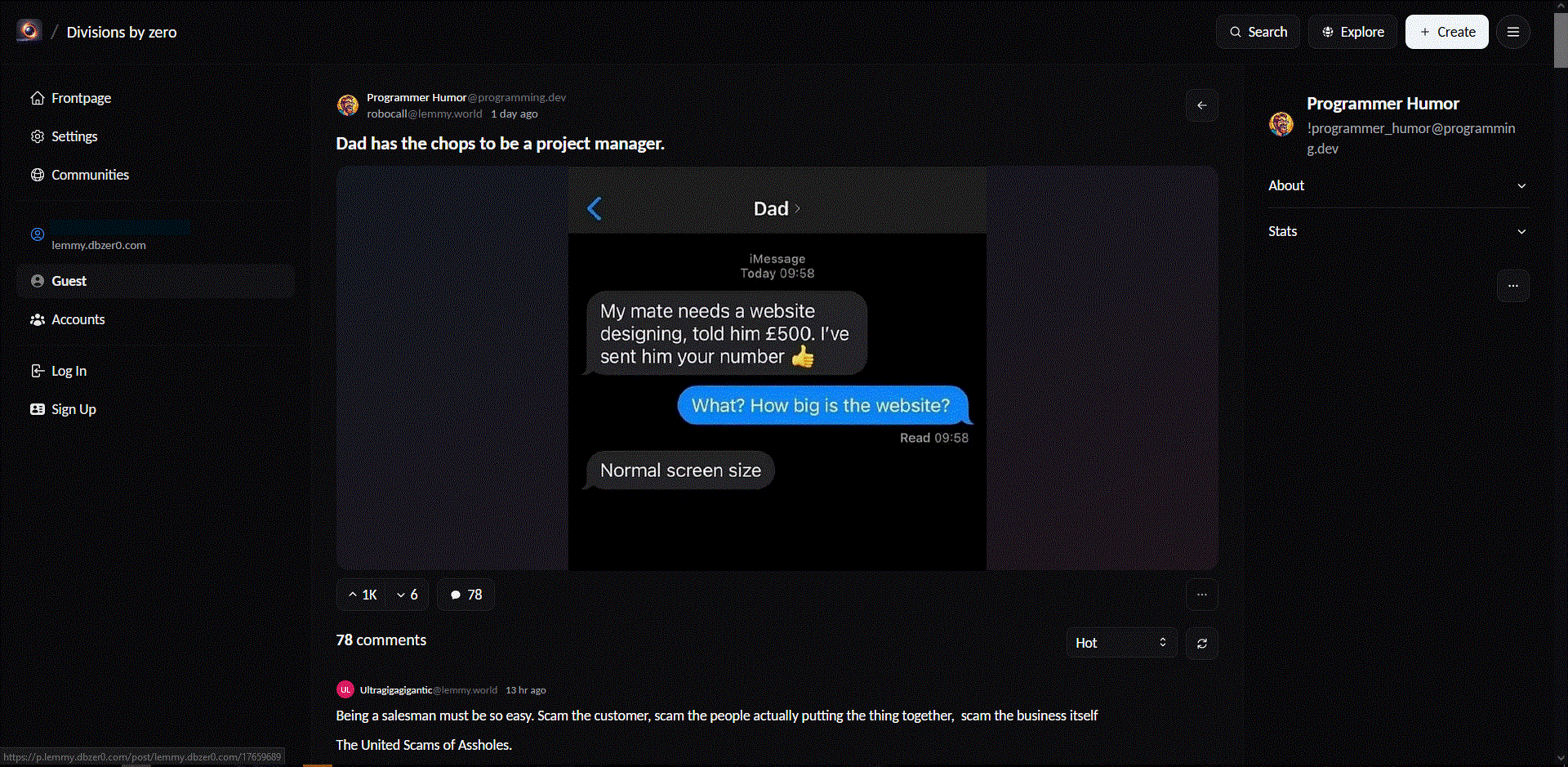
robocall@lemmy.world to Programmer Humor@programming.dev · 8 months agoDad has the chops to be a project manager.lemmy.worldimagemessage-square92fedilinkarrow-up11.21Karrow-down17
arrow-up11.2Karrow-down1imageDad has the chops to be a project manager.lemmy.worldrobocall@lemmy.world to Programmer Humor@programming.dev · 8 months agomessage-square92fedilink
minus-squareHopFlop@discuss.tchncs.delinkfedilinkarrow-up4·8 months ago Lots of websites with menus on the left! Can you send an example? I’ve only seen these foldout side bar menus.
minus-squareStrykker@programming.devlinkfedilinkarrow-up15arrow-down1·8 months agoYouTube, google drive, Any readthedocs site with more than 1 page
minus-squareMicrow@lemm.eelinkfedilinkarrow-up3arrow-down8·8 months agoWell, the youtube menu is most likely positioned there because they dont want people to use it.
minus-squarepirrrrrrrr@lemmy.dbzer0.comlinkfedilinkarrow-up8·8 months agoEvery site in the early 2000s had a left nav menu
minus-squareZagorath@aussie.zonelinkfedilinkarrow-up7·8 months agoWikipedia, especially the new design with the table of contents in the sidebar.
minus-squareAWildMimicAppears@lemmy.dbzer0.comlinkfedilinkarrow-up6·8 months agoLemmy Frontend called Photon:
minus-squarePng_Yakuza@lemmy.worldlinkfedilinkarrow-up3·edit-28 months agoHere’s some articles written about it as well from NN group if you’re interested https://www.nngroup.com/articles/vertical-nav/ Here’s an article on user attention on website predominantly leaning left as well as a related topic https://www.nngroup.com/articles/horizontal-attention-leans-left/
minus-squareSpaceCowboy@lemmy.calinkfedilinkarrow-up2arrow-down1·8 months agoI’m looking at a page right now that has some buttons for “Subscribe, Create a post, Block community” on the side. But I guess it’s on the right side and maybe since they’re buttons it doesn’t count as a menu.
minus-squareKairuByte@lemmy.dbzer0.comlinkfedilinkarrow-up2·8 months agoTo be fair, those are less a nav bar and more contextual content. You likely also have the main nav bar along the top.
Can you send an example? I’ve only seen these foldout side bar menus.
YouTube, google drive, Any readthedocs site with more than 1 page
Well, the youtube menu is most likely positioned there because they dont want people to use it.
Every site in the early 2000s had a left nav menu
Wikipedia, especially the new design with the table of contents in the sidebar.
Lemmy Frontend called Photon:
Here’s some articles written about it as well from NN group if you’re interested
https://www.nngroup.com/articles/vertical-nav/
Here’s an article on user attention on website predominantly leaning left as well as a related topic
https://www.nngroup.com/articles/horizontal-attention-leans-left/
I’m looking at a page right now that has some buttons for “Subscribe, Create a post, Block community” on the side. But I guess it’s on the right side and maybe since they’re buttons it doesn’t count as a menu.
To be fair, those are less a nav bar and more contextual content. You likely also have the main nav bar along the top.